Wednesday, October 26, 2016

My Trusty Little Companion


Say "Hello" to my trusty studio companion.  This is my painting cart.  This little beast started as a set of Ikea storage boxes and has grown into what it is now.  Originally I just wanted something to set my pallet on when I painted on the studio wall.  For this I added the sides and a fourth drawer.  The trash can found a new home under it soon after.  Then I wanted a place to store items and sketchbooks so it got wider.  I wanted it more mobile so it got some wheels.  About a year ago I added the toilet paper roll holder.  I use T.P. for wiping brushes, pallet knives and my nose.  My last change on it was about three weeks ago.  It was a minor addition but an important one, I added a bar to keep the brush cleaners from sliding off the edge.

This cart been in my studio for about 15 years now.  The glass pallet originally had a cover and a handle and it is the same pallet I used to carry into Art Center for painting class.  So this pallet has been around for maybe 20 or more years.  Crazy Huh?

Here's a view from the other side.  I have sketch books, my goal organizer, misc. business books, a portable print portfolio, some magazines, brushes, paint cleaner, and such on this side.

On the other side (first photo) you can see where I store my mediums and varnishes under the T.P. holder.  Under the chemicals is the place I can throw reference material for the active paintings.  This space holds standard sized vanilla envelopes.  Each painting or series gets an envelope and all reference, sketches and notes get put in there.  This is held over from my commercial art days when I kept "job folders" for each project.


Here's a top view.  I have a coffee cup for a brush holder.  The cup is from Denali State park in Alaska.  I filled the cup with dried beans so my brushes stand up.  You can also see wells for pallets knives, a putty knife, paint sticks and larger brushes.  All the stuff up here kind of moves about depending on the painting and what tools I'm using.


Here's a peek inside the top drawer.  It is for extra brushes and some napkins for blotting brushes.  Lots and lots of brushes.  This drawer usually stays open so the napkins are readily available for blotting.  My pallet scraper is next to the napkins.  For oils, it's important to keep a clean pallet so the various colors do not get too contaminated with unwanted colors.  Sap Green can get into EVERYTHING if left smeared about on a pallet.


The Second drawer down is for the paints I most commonly use.  My basic pallet is Burnt Umber,  Raw Umber, Yellow Ocher, Ultramarine Blue, Naples Yellow,  Burnt Sienna, Ivory Black, and Alkyd Titanium White.  These colors are derived from what NC Wyeth used.  He's my all-time favorite artist and I studied his paintings all through college.  These colors are in the front of the drawer.  For the colors I use most often I purchase the large tubes.

Supplemental colors, located near the back of the drawer include Cerulean Blue, Cobalt Blue, Cadmium Yellow, Lemon Yellow, Cadmium Red Medium, Sap Green, and a few others that I hardly ever use.

The pliers are used to open the tubes. 


The third drawer from the top is for all my other oil paint.  These are extra tubes of the same colors as in drawer two or they are random colors that I just can't bear to give away but are never used.

Price range for a small tube of oil paint is $8-$25 depending on the color.  Brushes can carry the same price tags.   Yikes!!!!


The bottom drawer is for all the other "Stuff" that goes along with my oil paints.  It's a catch all.


Hopefully you found this kind of insightful.  I think it's always fun to see the behind the scenes stuff of someone's work space. Help gives you a glimpse as to what goes into a piece of art.


Take care,

Larry


Saturday, October 22, 2016

The Final Killer


For me, most paintings develop and are finished pretty close to how I had expected from the start.  This isn't by accident.  I spend time developing the drawing, picking colors collecting reference and when it's time to execute, I'm generally ready to "get er done."  But with this killer whale painting, I just wasn't pleased with the direction it had gone.  I tried changing colors in the back buildings, I tried making the buildings lighter, I tried a few things but nothing was working.  I just didn't like it.  It had just too much information, your eyes wander around looking for something to latch onto and in doing so we lose the fact that the whale is floating.  I couldn't come up with a decent fix it plan so I left and went on a weeks' vacation.     

After my return I went back to my first few rough sketches.  Here's one to the left.  You can see in this sketch the back building are very meaningless.  They're just indicated with a few lines.  This is what I needed.  Let's start the buildings over - Auggggg!!!!    I either do this or I sand everything down and start a new painting.  I might as well try it, right.   If I don't like what I try I'll bring out the sander and completely erase this painting.  I've done it before and I'll do it again if I need to.      
     As soon as I put the first bit of sky color over the buildings I saw and knew what I needed to do.   As you can see the changes have been major.  The back buildings have changed dramatically, there is no more dome on the left building, the sign is getting filled in and there is a shape of a figure in the lower right hand corner.  The painting was crying out to me for these things, I just needed to listen.  I really love the new back buildings.  These where scratched in like a child's primitive drawing.  Here's a couple of close ups along with the figure getting fleshed out a bit: 


This idea of scratching the paint will be something I play around with more.  Below is the final painting.  What do you think?


Now I just need to come up with a name.
Killer Whale Painting?
Walking in the Shadow of my Gloom?
Checks in the Mail?
Walking the Dog?
Life is Good?

What's the painting about?  Well it changed from its original idea.  It's now about depression.  If a person is depressed they take this feeling with them where ever they go.  Some people think they hid it well, some pretend like it's not there.  I think the key to overcoming it is to acknowledge its presence and learn to walk outside of it encompassing shadow.  You'll never be rid of it, it will always be there so learn from it, deal with it, pray about it and press on.  A lot of time it's easier said than done, but just remember, Life is Good.  I know this from personal experience.

Take care,

Larry

Saturday, June 25, 2016

June 25 Tractors


To Dig Deep   30 x 40    Oil on Canvas
I like tractors.  Enough said...

Actually, there is a little more to be said here. Scientia Fideles Defendit translates from Latin to mean: knowledge protects the faithful ones.  This saying is about creating a solid understanding of the Lord.  Luke 6:46 is about the wise and foolish builders.  A wise person building a house will dig deep to lay the foundation on solid rock.  A foolish builder does not and his house is destroyed in flloods and winds.  These clues I am giving lead to family values and knowing the Lord.  But, how does this blend with a tractor hanging from wires?

I have spent countless hours on construction sites. I have seen this many times:  The mechanic arrives early and starts warming up the tractors, they sit unattended.  At lunch the drivers will leave the tractor running while they go take their break. At a controlled site this may be okay but so many times I have seen cars pull up and some kid or a group of kids get out,  jump the short orange construction fencing and go running up to the tractors.  Usually, last out of the car is Dad.  He yells a few things at them but doesn't do much to stop them. When the tractor drivers see what's happening they start screaming at the kids to get off, then Dad becomes upset and then everyone gets mad, the driver, the dad and the kids.  If you really think about it, if the kids were to get in there and change the controls or the tractor blew a pressure hose or if the driver jumped in, unaware the kids were around, and drove off, someone could be killed!  

I have often wondered why a parent would stop their car, let the kids out, allow them to jump barriers just to show their kids potential death, but not show them Life.  This goes for many things, not just tractors.  Let's go see a scary movie about a possessed killer and fill our heads with cruelty. Let's go to the river and try and drown ourselves. Let's get on our bikes and try and break our backs Etc, etc, etc.  These are all fun things and I'm absolutely not opposed to them.  But....  Why not show the same excitement for church?  In all these things we are trusting in God to protect our kids, so why not stop the car, jump barriers and get to know Him a little more? 
Don't just trust the tractor.  Ignorance kills.

Prints of this painting are available!  Easy to order.  Here's where to go:
http://fineartamerica.com/featured/to-dig-deep-larry-reinhart.html

I should be able to get back to painting the whale very soon.  It's been a busy week.  Gotta love life!  Today (Saturday) I'm off to Search and Rescue training in the mountains.

Larry

Friday, June 24, 2016

June 24 Something else, a horse perhaps?

The Four Horsemen   36 x 60 Oil on Canvas
I'm think'in that if I don't have anything to share regarding the whale painting then I should share something else.  So here's something else:

My painting of the Four Horsemen.

The four horsemen are called upon in chapter 6 in the book of Revelations.  To understand what these riders represent you must actually do a lot of reading and interpretation but a good place to start is chapter 6.  Interpretations may vary but what I have gathered is that the white rider represents the false prophet, the antichrist, the red horse could be the next big world war, the black horse brings recession and poverty to all and the last horse, described as the pale horse, brings death.  These are gruesome things and the riders who enact them will probably do horrific acts as they bring these revelations to reality. 
After explaining this, I have been asked how I could possibly paint these horses to resemble childish toys.  Here's what I was thinking:
We are given toys to play with at a young age so we can learn from them.  We learn how mechanical devices work, we discover cause and effect, we can even learn how to share with others and to respect the toy for what it is, who gave it to us, etc.  God, who created these horses doesn’t really need them or the riders to process His judgment, He could simply snap His fingers and we would all be obliterated.  But by bringing each horseman out he is giving us the opportunity to learn from what is happening and make a life saving decision, Salvation.  So I'm saying these horsemen are like toys.  They are a means to teach us in a way we can understand, interact with and learn from.  Brutal toys, yes, but still toys.

In Matthew chapter 24, Matthew describes the early stages of the tribulations as birthing pains for what will be coming in the end.  If this is true then these horsemen would be coming early on and there would be lot more things to follow them. So in representing these horsemen as toys I think they would be simple, like pull toys a young child could grow to play with.  

It's just how my thought process is.

Prints of this painting are available through my print on demand site :
They are awesome prints, available in many sizes and are very reasonably priced.  Come check them out!  I recommend a print on the Archival Matte paper.

Larry

Thursday, June 23, 2016

June 21-23 It's HOT.


We left off like like this.
It got up to 115 degrees here.  It's hot and I cry like a baby when it get's hot.  The feeling of my skin boiling disturbs me.  It's hot!

Okay, had to get that out of my system.

No more red trim
It was hot though...  I'm disliking anything hot this week and I think my brain involuntarily made me take out the red trim on the building.  It reminded me of a sun burn.  It's out!

But seriously, when was the last time you saw red trim on a building, and with such thick window glazing like that.  I had a dose of reality.  By slowing down and noticing buildings as I was driving through town (with my AC blowing on high and all vents on my face)  I began to see my mistakes.  This is actually common for me.  I start a painting and I do so with a "feeling" of the scene.  I don't directly copy a particular place.  Then, after I get going, I start to add bits of realistic elements that help the scene come together.  These bits come from me being more aware of things.  When I start to paint the truck I will probably become more aware of how light bounces off the shiny surface, how the shadows roll around the body, etc.  But if I'm not actively painting a car or truck then I don't take much notice.  Make sense?  Taking the red out also gives your eyes a break.  Gives them more room to move about.

Here's where I'm at today.  
I'm still mentally wrestling with the sign.  Not sure how to kick it's butt yet.

Scraped in lines for the wires.
Under the flippers
What to do next?  I need to pay attention to windows in the sunlight.  How much can you see through them?  How much is reflected?  How do the hot spots show?  I also need more stuff - AC units to keep everyone cool on the roof, door knobs, graffiti - who knows - I just need to make it more lived in.  I have a lot of things to look at.

Larry

Monday, June 20, 2016

June 19th / 20th Some changes

Here's where we left off.
Adjusted some things
Here I go adjusting things.  I'm remixing and matching and or adding to existing colors.
Close up of texture
Another close up
Here comes the sky
Adjusted sky color
Here's where I'm at now.  The sky is painted, but not complete.   The paint got a bit thick and slimy so I'll let it set up for a night and let it get tacky then go go back in and bring in additional color.  I lost that bit of bronze color by the dome (in the sky) - I'll bring that back in probably.  Also note that some additional changes have been made in the shadows.  Also added a bit of reflection of the whales chin in the window.

The dome looks darker and the Denny's sign is not so intense.  But I haven't touched them.  It's just the relation ship to the sky.

Next round I'll go after the background building, then sign, then?

Larry

Saturday, June 18, 2016

June 18th, Why the sign and why changes are needed?

America's Diner
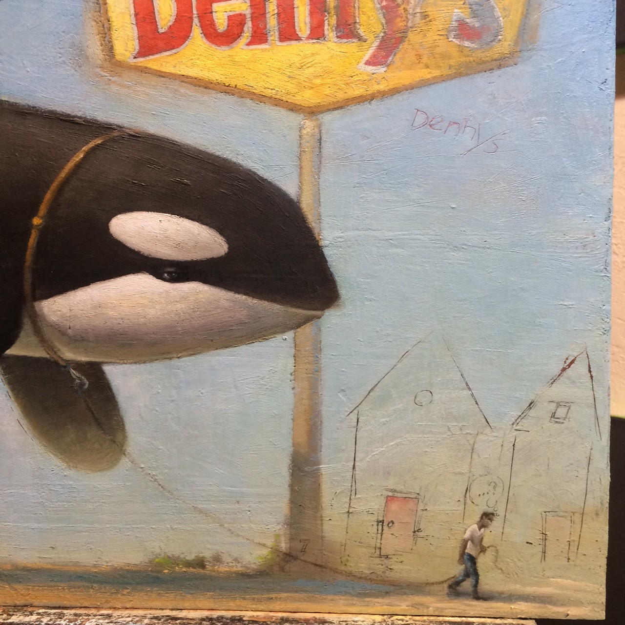
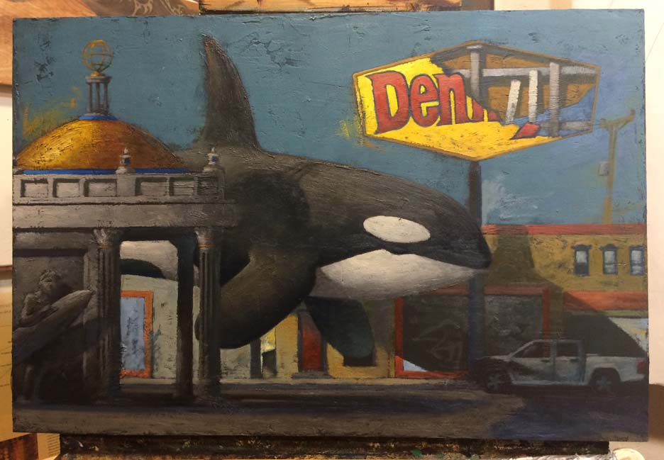
I was asked "why did you choose a bright yellow Denny's sign instead of another generic restaurant with a less powerful contrast to your painting?"     Good question, thanks Seven.

This questions comes after I commented that my saturation is kind of crazy throughout  my painting.  If I would have chosen a sign solely based on how it would look in the painting, contrast wise, then it would have been very easy for me to pick one or even make one up that blended right in.  But I needed to pick one that helped to tell the story.  It needed to be one I was familiar with because it is after all, my story.  In addition, the sign must also be familiar to a lot of people to make it easier for you all to understand my point of view. The color yellow is also important to the story as well.  Here's what I'm thinking:

Denny's is the "America's Diner."  I think of it as the "worker's restaurant."  It's almost, if not, an American icon.  The food is bland to meet the needs of many, the service is friendly, but not over the top so many people feel okay with their visit, the interior is utilitarian so it holds up well and is comfortable to many.   But.. I think the prices are crazy.  For a few dollars more why not go to Chilly's or Red Robin or somewhere else?  Why not spend a couple more dollars and go to a place with a theme, with food with flavor, a team of waiters, bus boys, drink fillers, food bringers, etc?  Why not go to a place where the walls are interesting, where they have decent stuff to look at?

Because - Denny's is for the working class of people, a worker's restaurant.  We go there because our bellies can't take the spices from Chilly's.  We can't afford to be sitting on the throne if we eat something that our bodies reject.  We go because it's midnight and no one else but DelTaco is open. We go because we are passing through and we know it and it's easy.  Or, we are tired and just need decent food before flopping down to bed.  Or, because we need decent food to keep us going through the day.  We go because we work odd hours.  We go because we don't want the crowds or the people in our faces, we just want to sit and read the paper.  We go so we can hang out with our friends and actually hear one another or not have to wait an hour for a large table.  That's why we go.

 Keep in mind these are my thoughts, ideas and opinions.  I'm not telling anyone they should think like me and I don't want to get into a debate about Denny's.  Just say'in.  If you eat at Denny's or not, I don't mean to offend anyone with my personal observations.  This is one of the issues that occasionally pops up when I start telling people my ideas (I've got some crazy ideas sometimes.)  I'm not always going to think like everyone else.  I'm okay with that and I hope you would be too.

So why the Denny's sign?  Because that side of the street is the working class side.  Big hint here as to what the painting is about. The yellow represents the worker's gold or the worker's value.  It's a beacon of hope, food, companionship and comfort.  Why is it falling apart?  Because it's tired, warn out, not taken care, etc.  It's in need of a change!  (Not equal pay! - whoops, another of my own thoughts - sorry.)

Did you know: If I painted this painting and tried to use the Denny's sign as a means of selling the painting because of Denny's notoriety, I would be in violation of their trade mark.  But, I am free to use the Denny's logo in my work if I am using it as a means to convey my ideas, make a statement, log history, etc.  To defeat me Denny's would need to prove that the success of this painting relies solely on the fact that their registered logo is present.  Let's face it though - someone's going to purchase this painting because of the whale, not the Denny's sign.   

New Shadows
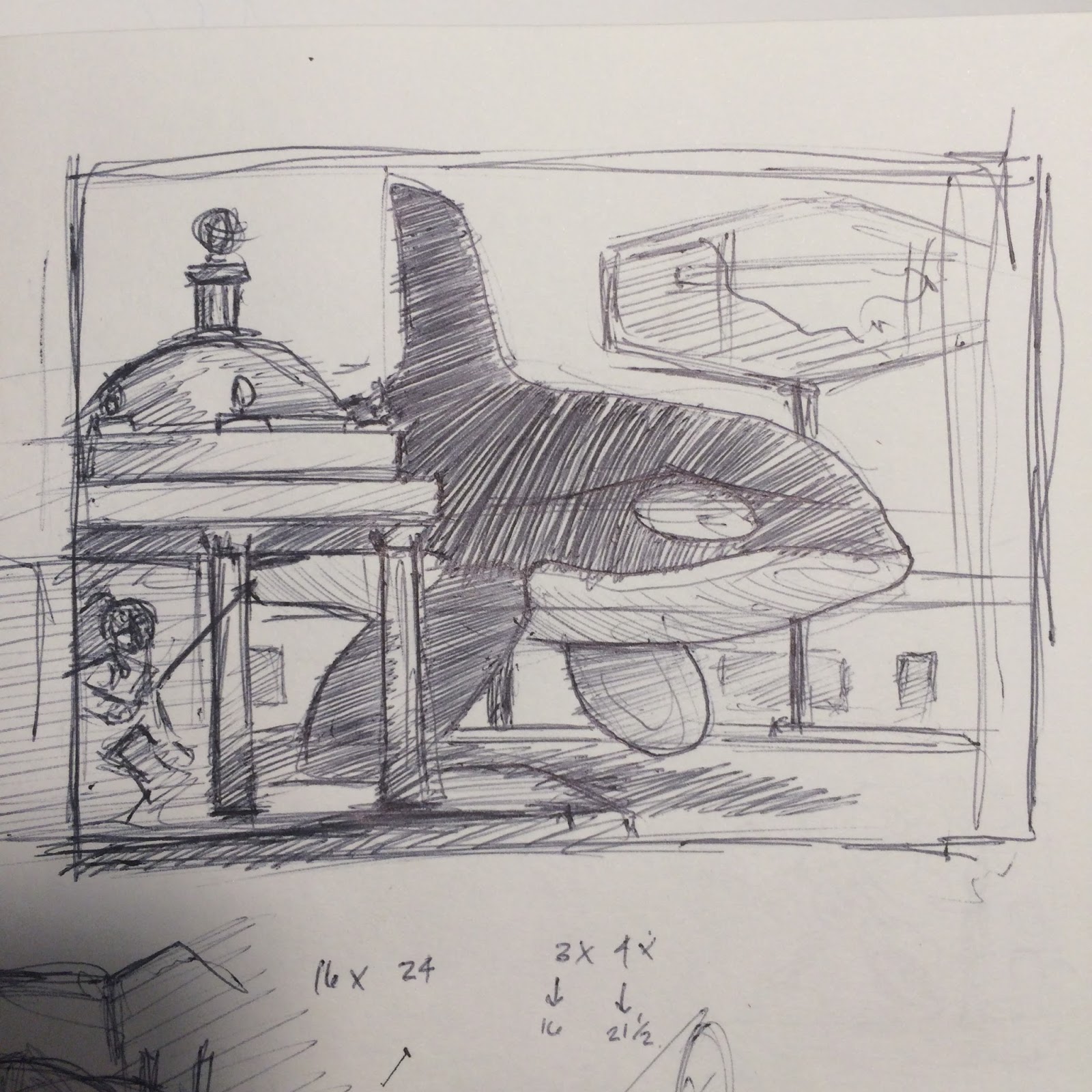
On another note: I made additional changes to the shadows.  The way it is now is just not working.  The fin was too far away from the flippers.  The shadow cast from the left hand building is not good either.   Here you can see where I have drawn over my original drawing.  Just play'in with ideas.  These shadows don't need to perfect, they just need to work, to feel right.  The shadow of the whale I want slightly oppressive, doom-ish.  But, I don't want the other shadows to have the same affect.  The other shadows should feel normal and give a sense that they exist and the world is just passing by.  Not sure how to explain myself here.  This is the kind of "tweak" I think about when I say the shadows should work enough to feel right but can also help give the sense that something is wrong or askew.  It's a juggling act.

Color comp 2

I also played around with the color comp.  I tried printing it out, but my fairly new Epson printer is crap! (more of my own thoughts) I think I need to give up this preference of brand and change printers.  Bummer.

Anyways - I wanted to see what the image would be like if I shifted the color in the sky .
I am thinking darker from the left, behind the whale.  Like he is bringing the doom behind him, or bring the darkness with him where ever he goes.   (play the music from Jaws here!)

Original color comp


See the difference?  This is the original one.

The whale is coming from the bright and happy side.  Like he's the bringer of spring flowers.  But he's not.  With the new colors in my head I am reversing the roles.  Kind of changes the entire feeling of the whale huh?

Do you know what he represents?


With the testing I did on the color comp, I think I'm ready to paint the sky.  This is good because I'm at the point where I almost can't move forward without doing so.  Like I said before: the sky will dictate the color and brightness of everything else.  Once I nail down this big hunk of value and color I can get into the grit of the rest of the painting.  Imagine though, if I would have painted the sky right from the start.  It would have dictated me, lead me toward a finish I maybe wouldn't be happy with.  Blocking in as I have done has left my mind open to changes and new thoughts.  It has allowed me to change directions without wasting too much time or paint.  With blocking in, I can see the colors develop full size (as apposed to a small color comp) and I can help these colors interact with one another and nurture them to a finished painting.  In the next post I'll show you how the changes above have changed the painting.

In other news:
I completed a new portfolio for my website today.  Stop by and check it out: http://www.larryreinhart.com/#!people-we-may-know/ow1do .  This portfolio is for all of my figure paintings (paintings of peoples).  I only have one more portfolio to go, My Obsessions.  If I stay on track I'll have this last one completed by end of next week.  I also entered a small landscape into a contest in hopes of getting my name out there and maybe get the opportunity to get some free supplies.  This weekend I have a meeting with a Redland's charity association regarding an art show scheduled for next month. I need to spend some time getting a CD ready with bio, images and such for their publicity.  The organization is also looking for a donated piece of art work so I need to make a decision here too.  Also this weekend I'm meeting with some locals and we are going to try and start up an "En Plein-Air" painting group.  En plein- air is when you go out into the public and paint things like landscapes, parks, or whatever.  This is different from painting in the studio with the air conditioning running - Big difference - -Huge difference!  The part of this blog where I spoke about blocking in and nurturing the colors - outside in just a few hours - there's wont be too much nurturing going on.  But it will make me a better painter, I'll learn from it and grow from it.  It'll be exciting.   
And don't forget it's Father's Day this Sunday!
With all this going on, I'm still confident I can make some good progress on my painting.

Hope you're having a good weekend.  Happy Father's Day to all the father's out there.

Larry

Friday, June 17, 2016

June 17th, More Grays and a side walk


Before
After
This time the changes may be less noticeable, but if you compare, you'll find them.  Some areas are getting a second layer of paint.  I'm just beginning to get into the phase where I play around with the paint.  I'll try and shoot some close-ups for next time.
Original color comp
I think I'll have to make a decision on the sky and paint it out soon.  If I can get the sky going good and the small details - like the window pains in. I'll be able to move about this painting quicker.  The blocking in of the color takes thought and time.  But after that it I'm more free to just push paint around, play with colors and edges and such.  I may need to rework the color comp to get a visual on what I'm thinking to make sure it will work.  I'm thinking if I don't do this and the image fails I'll have waisted some paint and time.  I'll scan in the color comp and then print it out.  This will make it easier to add color to it and preserve the original.  I could do this digitally, but I prefer not to.  I like the hands on feel.

Website update: I got four more images ready for my "People We May Know" portfolio. They aren't posted live yet, though.

Larry

Thursday, June 16, 2016

June 16th Feel'in the grays


Where we left off

Starting the grays

Now
I'm starting to feel the color.  Things that I'm think'in about include:

   1) The saturation on my colors is over the top.  It's almost confusing to me since I normally don't have so much color.  What's bug'in me the most is that back line of buildings.  I know they'll get toned down, but they're still there.

    2) Another issue is, what's my focus.  Per my color sketch, I was going to lead you in from the direction the whale came, at street level.  I hinted at this in the color comp but didn't quite nail it down.  I sketched a person near the right hand border yesterday and I think I will use it.  So now I think I need to change my focus.  Do I make the figure the focus, the whale or keep the original intent and make the figure a third read - still deciding on how I'm going to tell this story.  

     3)The white circle on the whale is going to be difficult to conquer.  It being white, with a sharp edge next to the black makes it a natural focus.  That contrast will naturally lead your eye right there.  The white of the circle will be competing with the lightest portion of the painting too, another natural focus.  If I want to make the figure the focus I will need to conquer the whale first.  What about that sign?

     4) That sign is getting too busy and it's way too much of a distraction.  I need to tone it down.  I'll pick my focus then hit the sign.  It's mainly the inside guts of the sign.  The yellow and red of the broken face I can work with.

Up next, I'll continue with the grays and whites.  I'll probably move down into the road so I can get rid of all that darkness down there. As I work I'll continue to think about the four items above.  This painting is evolving.

Did you know?  On the whales chin, the white section next to the flipper, there are two kinds of shadows here.  One is a cast shadow - created from the flipper casting a shadow down and across the chin.  This type of shadow produces a sharper edge.  The second kind of shadow is the form shadow.  The form shadow is created as the round body the whale curves around and goes into shadow.  The curve is gentle and creates a soft gradient shadow.  Combine the two and object your painting starts to feel real.  I usually doesn't matter how abstract or rough you paint, if you get the shadow convincing the painting works.

Larry

Wednesday, June 15, 2016

June 14 - 15th. Red Paint

Where we left off

Painting with red
The pallet

Here's a shot of the pallet again.  At least I didn't make this one the opening image.

You can see how the colors look a bit muddy on the white pallet, but saturated on the painting.  This is just the nature of the beast.  Some people mix their paint on a colored pallet or a grey pallet so they can judge the color better.  I have been painting so long with a white pallet it doesn't matter.  I know what I'm mixing and there's no need to fuss about it.

Last red
So, it's coming along.  A bit slow, but that's okay.  I've made some adjustments to the shadow placement and sketched in a figure near the truck (on the drawing).  Things are evolving. Do you think the red paint has a meaning?

I'm been overly anxious to get my website whole again so I have been spending extra time on that as well.  Also writing these blogs takes away from the painting time as do the pictures and the little bit of editing I do to them.

Yesterday I didn't post.  I have a good reason though.  Twenty three years ago, my wife and I had our first date.  I took the night off, made some dinner, watched a movie with her and thought about this first date.  Definitely worth it (last night and the first date.)

Larry

Monday, June 13, 2016

June 13, It begins

Pallet
The title "It begins" sounds menacing to me.  But it really isn't.  The "it" is me and what is "beginning" is me do the painting.  Explained, and it's rather boring.  Well, so it the picture of my painting pallet.  If you're a painter though, you might find something interesting about the pallet picture.

Here are some shots from last nights paintings:

The beginning

Soon after the beginning

Later on, because I forgot to stop and take pictures in between.

I started with the yellow (obviously - I'm full of wisdom today huh?)  Yellow is a good starter color because the pure yellow in the sign will dictate how light the sky becomes, which dictates the color of the buildings, the whale, and everything else.  Most things I will paint darker at first so I can go back and rework with lighter colors.  It's harder to go darker without blocking the portion out and starting over.  I'm saving the texture, adding to it  and that's what I'm protecting.  I'll get about three layers of paint, on average, on a painting.

Ironically the yellow is kind of important to the meaning of the painting as well.  Anyone make up some ideas on what this thing is about?  What does the yellow symbolize?

In other news, I have been working all morning (and all week) on my website.  Tedious work but I like the changes.  I wanted to show case my work better.  I wanted the viewer to be able to zoom in on my work to see it better.  I wanted a clearer path for the viewer to purchase a print, share my work through Facebook, and pin it in Pinterest.  I wanted to have a space to tell more personal notes about each painting.  And I wanted to protect my art a little easier.  There's a lot of "I want" here but I want it to make it easier and more enjoyable for everyone else - including you.   I worked on the portion under "My Art" titled "Into the Wilds".  Here's a link: http://www.larryreinhart.com/#!into-the-wilds/g8m1n check it out and let me know what you think.  


Larry

Sunday, June 12, 2016

June 12, I'm ready to move on.

Base color done, I'm ready to move on.
Does it look the same as yesterday?    Naaa -

Yesterdays image 

Here's yesterdays.

I darkened the darks and put a second layer of blue in the sky.

I also have gone back and redrawn the image so I know what to paint and where to paint it.


close up of drawing


Here's a close up of the drawing. See the details in the columns?
I draw it straight to mess it up with paint, then do it again and again and again....

Kind of.

Actually, this will probably be the last time I redraw the image.


Original drawing
The darkening of the darks and addition of blue in the sky actually happened last night.  I couldn't sleep so I got up and painted.  Even though I used the Alkyd paints (the quick drying ones) the paint was still a bit wet this morning so I was kind of stuck with forward progression on this painting.  So I played around with shadow placement on the original drawing.  You can see the red and blues above on my drawing.  For the most part, my shadows are not correct.  I know this but most other people do not.  I make the shadows just believable enough to make the image appear to work.  But since they are not quite right there is something in the painting that appears to be off or mysterious but most people can't figure it out.  It's almost subliminal.  This is just one of the few ways I play around in my paintings.

Reference

Here's the limited reference material I have for this painting.  I have a shot of a Denny's sign too, but forgot to include it.  Everything else is made up.


In addition to playing around drawing shadows this morning, I also completed a small painting - 6x6, of a lion- I'll share this later, after it dries up a bit.  I also sat outside next to a small fire, drank some tea and read some of my magazine (relaxing).  Then I chopped enough wood to refill my wood box, it was pretty low from the winter months.  And finally, I took a shower and went to a Greek food festival.  By the time I got home the painting was dry enough to redraw the image on top.

I think I'm ready to paint now.  I just need to decide on what to paint first.

Larry

Saturday, June 11, 2016

June 11th, The first coat

First Coat
Okay, here we go.  The first bit of paint has touched the surface.  How does it look?

I told ya I draw it straight so I can mess it up with paint.  I have used a Fast Matt Burnt Umber, Ivory Black, Prussian Blue, and Alkyd Titanium White.  Here's why:

Fast Matt stuff is a dark brown and dries quickly - it's an Alkyd paint.  I mix a little bit of black into it to make it darker.  This is used to create additional texture.

The white is an Alkyd also so it dies fast.  This is mixed with the above brown and black, along with the blue to create the blue you see on the painting.  I put this down because I don't want you to see black in my sky colors as I skim across for texture.  This will make sense later, but needs to be thought about now.

Here's a close up of the texture so far:
First Coat and texture
I'm not exactly happy with the grey color of the base coat.  You can see how light it is by the whales far flipper.  I may need to change this in the future - we'll see.  So what comes next?  I'm going to darken up the background color near the bottom of the painting and get rid of the light grey I don't like.  I'm going to add another blue color to the sky to bring out the texture.  After that, the set up process should be done and I'll get into the straight paint.

At this stage of the painting I'm still messing around.  I'm not sure what to try next and whatever I try I'm not sure how it will turn out.  When I get into the straight paint portion I will be more at home but I will be working around or through other mistakes or happy accidents.  A painting shouldn't have a set process.  They shouldn't be assembly line made.  In every painting there should be a struggle, there should be a new discovery, there should be a culmination of your talent right there in front of you.  If this stuff is not there then what are you painting for?

Larry