Friday, June 17, 2016

June 17th, More Grays and a side walk


Before
After
This time the changes may be less noticeable, but if you compare, you'll find them.  Some areas are getting a second layer of paint.  I'm just beginning to get into the phase where I play around with the paint.  I'll try and shoot some close-ups for next time.
Original color comp
I think I'll have to make a decision on the sky and paint it out soon.  If I can get the sky going good and the small details - like the window pains in. I'll be able to move about this painting quicker.  The blocking in of the color takes thought and time.  But after that it I'm more free to just push paint around, play with colors and edges and such.  I may need to rework the color comp to get a visual on what I'm thinking to make sure it will work.  I'm thinking if I don't do this and the image fails I'll have waisted some paint and time.  I'll scan in the color comp and then print it out.  This will make it easier to add color to it and preserve the original.  I could do this digitally, but I prefer not to.  I like the hands on feel.

Website update: I got four more images ready for my "People We May Know" portfolio. They aren't posted live yet, though.

Larry

Thursday, June 16, 2016

June 16th Feel'in the grays


Where we left off

Starting the grays

Now
I'm starting to feel the color.  Things that I'm think'in about include:

   1) The saturation on my colors is over the top.  It's almost confusing to me since I normally don't have so much color.  What's bug'in me the most is that back line of buildings.  I know they'll get toned down, but they're still there.

    2) Another issue is, what's my focus.  Per my color sketch, I was going to lead you in from the direction the whale came, at street level.  I hinted at this in the color comp but didn't quite nail it down.  I sketched a person near the right hand border yesterday and I think I will use it.  So now I think I need to change my focus.  Do I make the figure the focus, the whale or keep the original intent and make the figure a third read - still deciding on how I'm going to tell this story.  

     3)The white circle on the whale is going to be difficult to conquer.  It being white, with a sharp edge next to the black makes it a natural focus.  That contrast will naturally lead your eye right there.  The white of the circle will be competing with the lightest portion of the painting too, another natural focus.  If I want to make the figure the focus I will need to conquer the whale first.  What about that sign?

     4) That sign is getting too busy and it's way too much of a distraction.  I need to tone it down.  I'll pick my focus then hit the sign.  It's mainly the inside guts of the sign.  The yellow and red of the broken face I can work with.

Up next, I'll continue with the grays and whites.  I'll probably move down into the road so I can get rid of all that darkness down there. As I work I'll continue to think about the four items above.  This painting is evolving.

Did you know?  On the whales chin, the white section next to the flipper, there are two kinds of shadows here.  One is a cast shadow - created from the flipper casting a shadow down and across the chin.  This type of shadow produces a sharper edge.  The second kind of shadow is the form shadow.  The form shadow is created as the round body the whale curves around and goes into shadow.  The curve is gentle and creates a soft gradient shadow.  Combine the two and object your painting starts to feel real.  I usually doesn't matter how abstract or rough you paint, if you get the shadow convincing the painting works.

Larry

Wednesday, June 15, 2016

June 14 - 15th. Red Paint

Where we left off

Painting with red
The pallet

Here's a shot of the pallet again.  At least I didn't make this one the opening image.

You can see how the colors look a bit muddy on the white pallet, but saturated on the painting.  This is just the nature of the beast.  Some people mix their paint on a colored pallet or a grey pallet so they can judge the color better.  I have been painting so long with a white pallet it doesn't matter.  I know what I'm mixing and there's no need to fuss about it.

Last red
So, it's coming along.  A bit slow, but that's okay.  I've made some adjustments to the shadow placement and sketched in a figure near the truck (on the drawing).  Things are evolving. Do you think the red paint has a meaning?

I'm been overly anxious to get my website whole again so I have been spending extra time on that as well.  Also writing these blogs takes away from the painting time as do the pictures and the little bit of editing I do to them.

Yesterday I didn't post.  I have a good reason though.  Twenty three years ago, my wife and I had our first date.  I took the night off, made some dinner, watched a movie with her and thought about this first date.  Definitely worth it (last night and the first date.)

Larry

Monday, June 13, 2016

June 13, It begins

Pallet
The title "It begins" sounds menacing to me.  But it really isn't.  The "it" is me and what is "beginning" is me do the painting.  Explained, and it's rather boring.  Well, so it the picture of my painting pallet.  If you're a painter though, you might find something interesting about the pallet picture.

Here are some shots from last nights paintings:

The beginning

Soon after the beginning

Later on, because I forgot to stop and take pictures in between.

I started with the yellow (obviously - I'm full of wisdom today huh?)  Yellow is a good starter color because the pure yellow in the sign will dictate how light the sky becomes, which dictates the color of the buildings, the whale, and everything else.  Most things I will paint darker at first so I can go back and rework with lighter colors.  It's harder to go darker without blocking the portion out and starting over.  I'm saving the texture, adding to it  and that's what I'm protecting.  I'll get about three layers of paint, on average, on a painting.

Ironically the yellow is kind of important to the meaning of the painting as well.  Anyone make up some ideas on what this thing is about?  What does the yellow symbolize?

In other news, I have been working all morning (and all week) on my website.  Tedious work but I like the changes.  I wanted to show case my work better.  I wanted the viewer to be able to zoom in on my work to see it better.  I wanted a clearer path for the viewer to purchase a print, share my work through Facebook, and pin it in Pinterest.  I wanted to have a space to tell more personal notes about each painting.  And I wanted to protect my art a little easier.  There's a lot of "I want" here but I want it to make it easier and more enjoyable for everyone else - including you.   I worked on the portion under "My Art" titled "Into the Wilds".  Here's a link: http://www.larryreinhart.com/#!into-the-wilds/g8m1n check it out and let me know what you think.  


Larry

Sunday, June 12, 2016

June 12, I'm ready to move on.

Base color done, I'm ready to move on.
Does it look the same as yesterday?    Naaa -

Yesterdays image 

Here's yesterdays.

I darkened the darks and put a second layer of blue in the sky.

I also have gone back and redrawn the image so I know what to paint and where to paint it.


close up of drawing


Here's a close up of the drawing. See the details in the columns?
I draw it straight to mess it up with paint, then do it again and again and again....

Kind of.

Actually, this will probably be the last time I redraw the image.


Original drawing
The darkening of the darks and addition of blue in the sky actually happened last night.  I couldn't sleep so I got up and painted.  Even though I used the Alkyd paints (the quick drying ones) the paint was still a bit wet this morning so I was kind of stuck with forward progression on this painting.  So I played around with shadow placement on the original drawing.  You can see the red and blues above on my drawing.  For the most part, my shadows are not correct.  I know this but most other people do not.  I make the shadows just believable enough to make the image appear to work.  But since they are not quite right there is something in the painting that appears to be off or mysterious but most people can't figure it out.  It's almost subliminal.  This is just one of the few ways I play around in my paintings.

Reference

Here's the limited reference material I have for this painting.  I have a shot of a Denny's sign too, but forgot to include it.  Everything else is made up.


In addition to playing around drawing shadows this morning, I also completed a small painting - 6x6, of a lion- I'll share this later, after it dries up a bit.  I also sat outside next to a small fire, drank some tea and read some of my magazine (relaxing).  Then I chopped enough wood to refill my wood box, it was pretty low from the winter months.  And finally, I took a shower and went to a Greek food festival.  By the time I got home the painting was dry enough to redraw the image on top.

I think I'm ready to paint now.  I just need to decide on what to paint first.

Larry

Saturday, June 11, 2016

June 11th, The first coat

First Coat
Okay, here we go.  The first bit of paint has touched the surface.  How does it look?

I told ya I draw it straight so I can mess it up with paint.  I have used a Fast Matt Burnt Umber, Ivory Black, Prussian Blue, and Alkyd Titanium White.  Here's why:

Fast Matt stuff is a dark brown and dries quickly - it's an Alkyd paint.  I mix a little bit of black into it to make it darker.  This is used to create additional texture.

The white is an Alkyd also so it dies fast.  This is mixed with the above brown and black, along with the blue to create the blue you see on the painting.  I put this down because I don't want you to see black in my sky colors as I skim across for texture.  This will make sense later, but needs to be thought about now.

Here's a close up of the texture so far:
First Coat and texture
I'm not exactly happy with the grey color of the base coat.  You can see how light it is by the whales far flipper.  I may need to change this in the future - we'll see.  So what comes next?  I'm going to darken up the background color near the bottom of the painting and get rid of the light grey I don't like.  I'm going to add another blue color to the sky to bring out the texture.  After that, the set up process should be done and I'll get into the straight paint.

At this stage of the painting I'm still messing around.  I'm not sure what to try next and whatever I try I'm not sure how it will turn out.  When I get into the straight paint portion I will be more at home but I will be working around or through other mistakes or happy accidents.  A painting shouldn't have a set process.  They shouldn't be assembly line made.  In every painting there should be a struggle, there should be a new discovery, there should be a culmination of your talent right there in front of you.  If this stuff is not there then what are you painting for?

Larry

Friday, June 10, 2016

June 10th, The colors

Whale color comp
Well, here's what I was think'in.

When I started, I didn't really have a color scheme in my head.  All I knew is I wanted it to be open air.  Open air as apposed to under water.  If I painted this to look like it was under water it would change the entire meaning of the piece.  It would turn it into a post apocalyptic / global warming thing.  That doesn't interest me.

Since I knew I wanted the image to be in the air I just started coloring what I knew, like the black of the whale.  Easy, huh?  This color comp is just to get the ideas going.  It's nothing that I will hold myself to follow.  As I paint, if things start shifting in another direction, and questions arise, I'll grab the color comp and change it so I can get a better idea on how to handle the rest of the painting.  The color comp is a tool.

On this painting I am already looking to the area under the whales belly and under his fin.  There's going to be some nice washed out light happening here and I'm think'in I want the alley way just under the fin to  be a hot spot - We'll see when we go big.  It may break up the eye flow too much and make the painting confusing.  I'll need to think more about this area.  Another area is the dark foreground shadow - it too dark, this will change.  The comp also tells me is how dark to start the sky - being next to the dark whale I'll need to stay darker so the sky doesn't look washed out.  Like I said, the comps are used to just get the ideas going - and they have started.

The comp itself is just an enlarged photo copy of my sketch.  This color comp is on the big side for me, it's 5x8 inches.  Most of my comps are in the 3 to 5 inch range on the long side.  I usually start with colored pencils and add acrylics.  This comp has 5-6 layers of pencil and two layers of white acrylic.  The white is used to lighten and to subdue (like the power pole in the background.)  For this painting I wanted to see what it would look like under water so I scanned it into photoshop and put a blue layer over it.  I was right about the look it gave and tossed it.

I'm getting excited to paint.

Larry

Thursday, June 9, 2016

June 9th. The not so exciting part.

Aspen's has been practicing portraiture.  Acrylic on paper
Had to give you all something worthy to look at today.  My daughter has been practicing painting people.  She sets her dolls up and paints their portraits.  This one is of her American Girl doll.  I'm think'in she did a pretty good job.  Look up these dolls - she nailed the expression.

So why did I need to prime you with something good?  Because we're at the non glamorous part of the painting, the non exciting part.  We're watch'in paint dry.  Yea.

Today I put on the third coat of paint.  The dark coat.  Here we go:

Supplies
My supplies:

Black flat exterior house paint.

Drill with paint mixing attachment (helps to get the small lumps plaster out)

Plaster is in a bag out of picture.

Assortment of painting knives and spatulas. I ended up only using the long skinny one and the very small one.

Mixing cup.
The blob


Here's the blob of paint / plaster mix.

 It's thick like cake frosting.


First


The  first coat went on really nice, at first....

But then it started to set up really quickly.

The plaster has a set working time.  This bag has a 15 minute time.  With the dry warm air today it really kicked.

The texture got out of hand so I just said what the hell and left it.

I went inside for about a half hour and when I came back out everything was dry.  It set up very, very quickly.   Let's try again -


Sanded

I grabbed my drill, put on the sanding disk and gave it a light buzz.  Just enough to get the high points off.  I could tell by running my hand across it it felt better but it was still too much texture.  So I mixed up another, thinner coat.

This second coat I mad a bit thinner - less plaster.  I also hit the surface with a mist of water to help slow down the kick.

The results:

Second coat of dark color
This time it looks okay.  I can live and work with this.  It has the amount of texture I'm after.  There's a couple of places I'll fill in a bit to even out and there are a few lines made with the knife I will sand off.  This coat is still wet (has been wet for over an hour and still feels cool to the touch).  We'll make corrections tomorrow or Friday.

In the mean time, I did the same treatment to another board but this time I used white paint.  Maybe I'll show you progress on this other piece if I get to a good point.

Tomorrow - surface corrections and / or a color comp.

Have a good day!!

Larry

Wednesday, June 8, 2016

June 8th The drawing phase


First part of drawing
Here's the first part of the drawing..  This is drawn based off the original sketch I did.  I was happy with the sketch so I just enlarged it and went for it.  I have a projector that I can use to enlarge my sketches.  The only bad thing about the projector is it needs to be done at night when I can get the studio nice and dark.  When I enlarge the sketch, or whatever, it generally goes fast.  This drawing was just a couple of minutes.  It all free hand so it's messy.  I then take rulers and other tools and create a good drawing.  Once I had this drawing up and going I started to doubt the placement of the whale.  He seemed off balance to me - or as if he doesn't have any room to swim to - he doesn't fit.  I could follow the Fibonacci method and mathematical plot my painting or I could use a lot of other gimmicks to make the perfect composition, but I don't.  The painting's mine and I paint it how I want.  If it doesn't feel right to me then I change it till it does.  Technical stuff - huh?

Moving the whale.

Moving the whale is easy.  I grab a piece of tracing paper and redraw it. I can adjust size if needed too.  Here I'm happy with the size so I just trace him.  Then I can move him about till I feel good about it.  I then grab my trusty old graphite paper (like carbon paper) and use it to transfer the whale down.  This takes maybe 5 minutes.  It's easy when you have the materials on hand to do this. 

Whale is moved
The whale is now moved.  Much better.

If I hadn't been so pleased with my original sketch I would have completed a smaller final drawing on a sheet of regular typing paper.  I would have worked out things on a smaller scale.  I could have then taken this smaller sketch into photoshop (computer editing program) and could have made additional changes - like moving the whale.  I would still have the same  step of enlarging this digitally adjusted sketch up to full size though.  And it never fails - when you draw small like 8 x 10 and enlarge to big like 36x48 there will be things that just don't look right.  But changes are easy, break out the tracing paper and make the changes.

Whale final drawing
Here's the final drawing.  The painting won't look this straight.  I draw it straight so I can mess it up a bit with the paint.  It's funner that way.  Anyone think they know what this painting is about yet?  Any ideas?  I don't have it 100% but it's definitely forming some thoughts.  It's these thoughts that made me add the old Denny's sign, power pole, truck, surfer, and ornate columns.  Hmmm?

I didn't get the 3rd layer on my painting surface today (the black layer).  I'll try and get that on tomorrow.

I do have this, if you're interested.  Someone had asked me to explain what "cradled" meant in relation to my painting panels.  This is what I do to the back of my boards to make them stronger and less prone to bow.  The wood on the edge of the panel that form the frame is what I call a cradle.  I think it's an actual term but not 100% sure.  Here's a picture:
Back side of Painting panel.

What's next?  Need to figure out how I'm going to color this thing.

Tomorrow.

Larry


Tuesday, June 7, 2016

June 7th. Here we go.

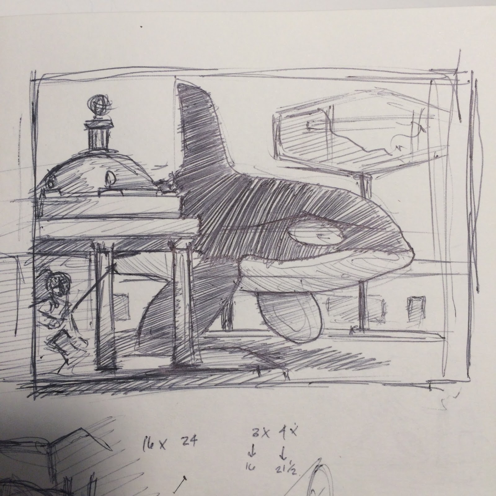
Killer Whale sketch
Here's the the chosen one.  The killer whale.  Anyone have a sense what this image is about, if anything?


Beginning of Killer whale drawing.
I have began to draw the final drawing, full size at 16x24 inches.  The paper I'm using is just some scrap I got when I ordered my last set of prints.  It looked like decent paper so I kept it.  Other paper I use includes the large rolls you can buy at the home centers for masking off windows and such.  Another kind I use is tracing paper.  It doesn't really matter, though.  In a pinch I've taped together plain sheets of typing paper.  These drawing aren't special to me, they're just a step in my process.  They help me focus on what I'm going to do. 

I usually do the sketch with the paper taped to the painting surface.  The paper is flexible and if it's a big painting it just gets way too big for my drafting table.  By using the surface as a "board" I can move it around or just lean it up against a wall if I need to finish something else on my table.

The surface I will be painting on is a wood panel, like a birch panel you buy at Home Depot for building cabinets.  It's good wood.  I take oak wood strips and cradle the back of the panel.  This is simply adding an inside wood frame to the back of the panel witch gives it strength and helps it not to bow.  The panels are always glued to the cradle strips - wouldn't want to nail it then have a need to remove it from the cradle at a later time.  If I need to remove a glued cradle I just run it on the table saw and cut it off.  I usually build the panel and cradle a 1/4 of an inch too big, then I trim it down to proper size.  This gives a very clean edge.  I seal the surface with traditional artists gesso.  For this painting I started with two coats of white gesso.  The next coat will be the house paint / plaster stuff.  I should be able to get this third coat on tomorrow.


The painting board with two coats of gesso
Edges are taped off to keep them clean. (seen with my white drawing paer taped on the front)

Need to get back and get this drawing done!

Other life things for today: Pulled 25 gallons of weeds (5 big paint buckets worth).  Washed my truck.  Messed around in the garden - I'm letting my carrots from last fall go to seed - I pulled a few to give light to the peppers.  Did the dishes after dinner.  Made home made southern ice tea. Had a killer headache, cured it with my wife's essential oils.

Have a good day!

Larry


Monday, June 6, 2016

June 6th. I think I have decided.

Cow Abduction  Oil on panel
I have spent the weekend contemplating.  After much of this I am ready to pick which painting to complete this month.

I chose the killer whale image.  Why?  My sketch for  this painting was pretty much complete, I don't have a lot to work out.  I have painted a killer whale before so this new one would just add to it.  I have the concept brewing and it is on the tip of my tongue.  It's diverse enough to be of interest to most - I think.  I have a surface on hand and it's the right size, ready to go.  All good things.

Why I didn't pick the statue between the column?  I need to work out the statue pose.  The color scheme would not be the most exciting thing to watch me paint.  I would need to create a surface for this one painting.  It just needs a little more TLC.  I think I'll wait.

So, what's next?  I need to start preparing the surface for paint.  It a cradled wood panel so it needs to be sealed.  I also need to work on the final, full size drawing so I can work out some last details.

I'll get started on these and get back to you with my progress!

This weekend I did manage to get a load of bark dust for the yard.  I pulled a ton of weeds.  I took a nap yesterday - a long one.  I made some awesome foods.  We bought a new chair for the living room - a recliner! - gett'in old!  I put the final color on my seated ram painting.  And I worked on the design of two other paintings that I will be working on soon - probably while painting the killer whale.

Life has been good.  I hope it has been good for you too.

Larry

Sunday, June 5, 2016

June 5th. It figures.

Figure sketch with stripes

I love painting stripes, especially on clothes.  I just don't do it often enough.  I also like yellow stripes.  Reminds me of caution tape, police lines, road stripes - things you don't want to cross.  But the color yellow is warm and beautiful, very inviting.  It's like a contradiction.

Here's kind of what I was leaning too with this seated figure:


I was thinking something kind of like this painting I did a couple months back.  But I want the new one to be softer and more sensual.  This painting here is too hard and direct.  The posture is tough.

I want to go more ambiguous with the facial features too. I want to larger so I can play with the paint more.  There's a lot of things to work out before I proceed with this one.


 For the back ground I was thinking something like I have been doing with my animals, like in this bear painting:
Can you image it yet?

I really do enjoy painting figures.  Especially females.  I think they (females) are incredibly beautiful. Their hands, necks, ears, everything about them is spot on.  God did a pretty good job when He created Eve.   I don't paint figures very often because I need a model.  Models are hard to find in Yucaipa and they cost money.  My wife doesn't like to model for me and I understand that.  I wish I could draw them off the top of my head, but I can't.  So what do I do when I need a model?  I build them.

The shoulders are different than the red panties.  The foot is different that the blue skirt.  Etc.
 I start out with a decent drawing depicting the pose and stuff I want.  Then I go hunting for the parts to make the model.  The three stages of the built model above are just a few of the stages I went through, definitely more complex than I am showing here.  Below I have taken the finished model and have drawn my figure to be used in a painting.


This painting by the way failed.  It was in the 18x24 range.  I struggled with and eventually destroyed it.  Thinking about it now I should have kept it.  I'm sure if I changed the style of dress and added stripes it would have worked.  But, sometimes it's better to just move on.


Here's another built model:
The early stage is to the left.  Then I changed direction and composition of the painting and so changed the model to match.  The hand holding the brush is actually painted digitally, I couldn't find good reference for it.   I never followed through with this painting.  It was never painted.  She was going to be painting images of animals on a cave wall, like what the archaeologist find from long ago.  Kind of a "tongue in cheek"  answer to who drew these types of images from so long ago.


So after further review and deep thought on this sketch:  I don't think I have the time to sit down and produce a model for this painting and get the painting done in time.  I also don't feel strong with a reason for the painting either.  There's not enough passion to back it up right now.  This is the artist and intuition talking here.  I think I'll save this one for a rainy day.

Now I'm down to two choices...

Larry